Introduction
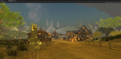
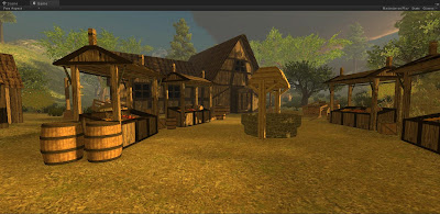
Over the course of the year, I managed to keep on track with this project with constant updates throughout. This lead to me having plenty of time towards the end allowing me to add in more detail and models to the final version. There was only one stage of the Dissertation where I went slightly off track with time, setting me back a couple of weeks, but soon caught up again, and went past what I was intentionally going to make as I had a lot of time left over. Making the village turned out exactly how I wanted it to, and since I wanted to work on lighting for the scene too, I spent a lot of time looking up different ways and methods of how to achieve this. Since I was aiming for a sunrise/sunset timezone, I needed the colours in the scene to match how they would in real life, as well as how the shadows would appear.
Time Management
When planning out the year, it's very difficult to work out exactly how long certain areas will take. This therefore lead some deadlines going slightly astray and getting completed on time. Not only that, but other projects were constantly on the go as well, leaving me with less time to work on it. But once everything had been completed, I could work on this all the time. Even though I knew time was creeping up on me and I was getting further away from the stages I needed to be at according to my proposal, I made sure that I never drifted too far away and that I could always catch up to where I should be fairly easily. Other than that, everything went well and managed to complete everything before planned, giving me more time to work on other areas. Since I was only planning on making the village, and being able to run around it in Unity, finishing early gave me time to make the Unity version look a lot better by giving the scene trees, terrain, plants, skybox and most importantly the lighting from the sun.
Research
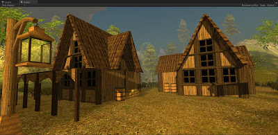
Through all the research that I had acquired before texturing the models, made it much easier to come to a decision as to how everything was going to look without having to make it up from scratch. However with the windows, I found looking through certain games, they are often kept quite simple and all followed the same sort of style. A window that contained a cross and that was it, so I thought it was best to go for this idea too as this window idea proved effective in my work as well. Since I wasn't going to make the inside of my houses, I decided to keep my windows black on both 3ds Max and Unity simply because I didn't want the player to be able to see through them, and black proved to look the best.
Other than that, plenty of research went into different areas of the models I was creating giving me plenty of ideas on how everything should be designed and made, and how it could look once textured allowing me to constantly work on my dissertation with ease.
Conceptual Art
Making the drawings (as simple as they were) allowed me to begin making the models at the very beginning straight away. However as I began making the initial ideas, I felt as though they didn't look as good as I'd hoped in 3D and to me looked too similar to some modern day cottages. So I decided to redesign them to something that looked a little more medieval and began work on remaking them.
All other concepts weren't altered, except the wagon. Rather than having 4 wheels, I decided it should only have 2 as again more carts/wagons in game tended to have only 2 wheels so i wanted to follow suite. There were some models that I'd made that I didn't draw up first, but these were just the models I made at the very end of this project that I thought of adding in at the last minute.
3ds Max
Texturing again as always proved to be the most time consuming part, and since I wanted to do it properly, made it take even longer. But this gave a really good result at the end, making all the time spent doing it pay off. Making the models themselves didn't take a great deal of time however some areas took much longer than others e.g. the houses where quite difficult, trying to make sure they all had proper geometry where all vertices are connected to each other.
Lighting through 3ds Max looked very effective. For this, I used the Daylight feature as this gave me the perfect form of lighting I needed. Through this feature, you can choose what time of year you want the sun to be in, which positions it for you in the sky so of course choosing January would make the sun much lower as to if it were in August etc. As well as choosing what time of day it was, and where in the world the sun is e.g. which country.
All textures applied to the models always had bump and specular maps added to them to really bring the models to life and make them look a lot more realistic and 3D. This was done simply by making greyscaled versions of the textured and slighting increasing the contrast between the lighter and darker areas. Lighter areas contain more bump and specular amounts.
Unity
Since I was still quite unfamiliar with Unity, I had to fully get to grips as to how t use the program again properly before I could really get on with anything. This didn't take a huge amount of time so I could soon get on with it. When everything was imported, and I could run around the scene, I found a few areas that were either not textured, or didn't texture correctly. Since there were so many small and tiny areas on the models, made it very difficult to textured every single tiny area until you can actually move around the scene seeing what the player will actually see. These problems were soon fixed simply by editing them in max and saving over the FBX version in the Unity folder.
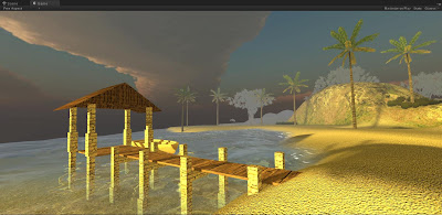
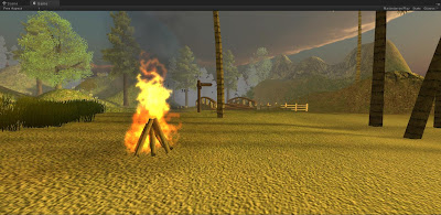
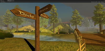
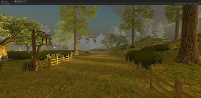
Once all that was done, I really wanted to make the scene more of a scene by adding in a terrain, a beach/sea, trees and bushes, and a skybox. I then decided to make a few more models for the scene such as a Jetty for the beach, a boat in which the player can start on, a small river with a bridge, a way post to show the direction in which the player must run to reach the village. This made the village feel more like a village, and rather than being at it from the very beginning, I wanted the player to explore a little before actually getting there. But there was still something important missing, sound. To really make the scene feel more realistic and interesting, it really need sound effects. So I started off by adding sound to the sea, followed by gentle cracking of a fire as you run past, onto a river flowing by and a waterfall in the distance. Birds singing as you run down the forest path, and once at the village, birds in the background still but with the sounds from the furnace, the smelter and the well. The scene needed just one more feature after this.
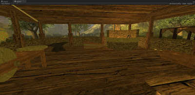
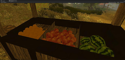
The lightsource for the sun. To really add depth to the scene, it needed proper lighting. This was probably one of the most time consuming areas of the whole project due to the time it took to either read up on how to do it, how to get a certain effect etc. But unfortunately there wasn't a huge amount of information out there about it, and some that I did find said completely different things to others. So the only way to find out how to light my scene properly was through trial and error. Due to the fact that light mapping proved to be VERY long to render made it very difficult to really test in great detail. As soon as certain settings were turned up slightly too much, render the light map would change from 10 minutes, to 2 hours. This became very annoying as I couldn't really find out what settings needed to be where to get the effect I wanted just from changing the settings a little at a time, then waiting 2 hours. Even with low settings, the rendering time often jumped drastically up in time once something was set too high. And this was only on a couple of objects! But I managed to get a pretty good result that I'm happy with apart from how the fruit actually turned out.
The character needed a script that allowed him to have footstep sound effects that played when running on different grounds to add authenticity to his movement. This proved to be very difficult since I'm not too good on the coding side, but eventually it was resolved and worked perfectly. The final detail I added in was an animation for the boat. Rather than just sitting on the sea not doing anything, not looking very realistic, I added an animation that simply made the boat rock up and down. Since the player starts off here too, you need to get the feel for it when sitting on the boat.
Conclusion
In conclusion, I'm very happy with how everything turned out, and by keeping good time management I managed to get everything done nicely on time at kept it all at a high standard giving the end result of the scene a very good one. Even though my course has come to an end, I will still keep this project going and probably keep this blog going as I continue to make progress to this scene over the coming weeks/months/years and hopefully make it more into a fully working game if I can get my head around scripting!


